Designing Your B2C Website for Optimal User Experience
1 April 2026
Let’s be real—when someone lands on your website, you’ve got just a few seconds to hook them. In the bustling world of B2C (business-to-consumer) websites, your design has to do a lot more than just look good. It needs to guide, delight, and convert.
Don’t worry, though. Designing a B2C website for optimal user experience doesn’t have to be rocket science. It’s about understanding your audience, making smart design choices, and obsessing over the little things that make a big difference. So, let’s dive into how you can revamp or build a site that’s more than just pretty—it performs.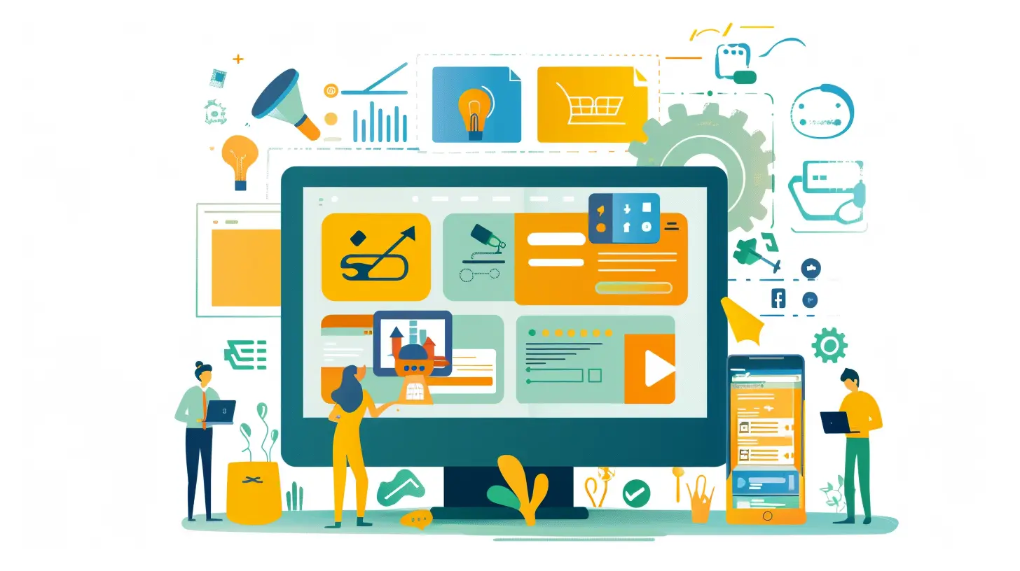
Why UX (User Experience) Should Be Your Top Priority
Before we get into the nitty-gritty, let’s get one thing straight: if people don’t enjoy using your site, they won’t stick around. Worse, they might bounce straight into your competitor’s lap.User experience is how someone feels when they interact with your digital presence. It's everything from how fast your site loads to how easy it is to find your return policy. And in B2C, where emotions drive purchases, that experience can make or break your bottom line.
Fun Fact:
A study by Forrester found that a well-designed UX could increase conversion rates by up to 400%. Yeah—four hundred percent.
Know Your Audience Like You Know Your Best Friend
Let’s start with the foundation—your audience. If you don't know who you're designing for, it's like throwing darts in the dark. You might hit the board, but it won’t be pretty.Create Buyer Personas
Get specific. What’s their age? What social media platforms do they hang out on? Are they impulse buyers or deal hunters? The clearer the picture, the better you can tailor every part of your site—from imagery to language.> Pro tip: Use tools like Google Analytics, Hotjar, or even good old-fashioned surveys to gather real user data.
Make Navigation a No-Brainer
Ever been to a website where you felt like you needed a map and compass just to find the checkout button? Yeah, don’t be that site.Keep the Menu Simple
Stick to 5–7 top-level navigation items. Don’t overwhelm your visitors with a wall of options. Use clear labels like “Shop,” “About Us,” “Contact,” and “FAQ.” Make it so intuitive, even your grandma could use it.Add a Search Bar
People are impatient. If they can’t find it, they’ll search for it—or they’ll leave. A visible and intelligent search bar (with predictive text, if possible) can save the day.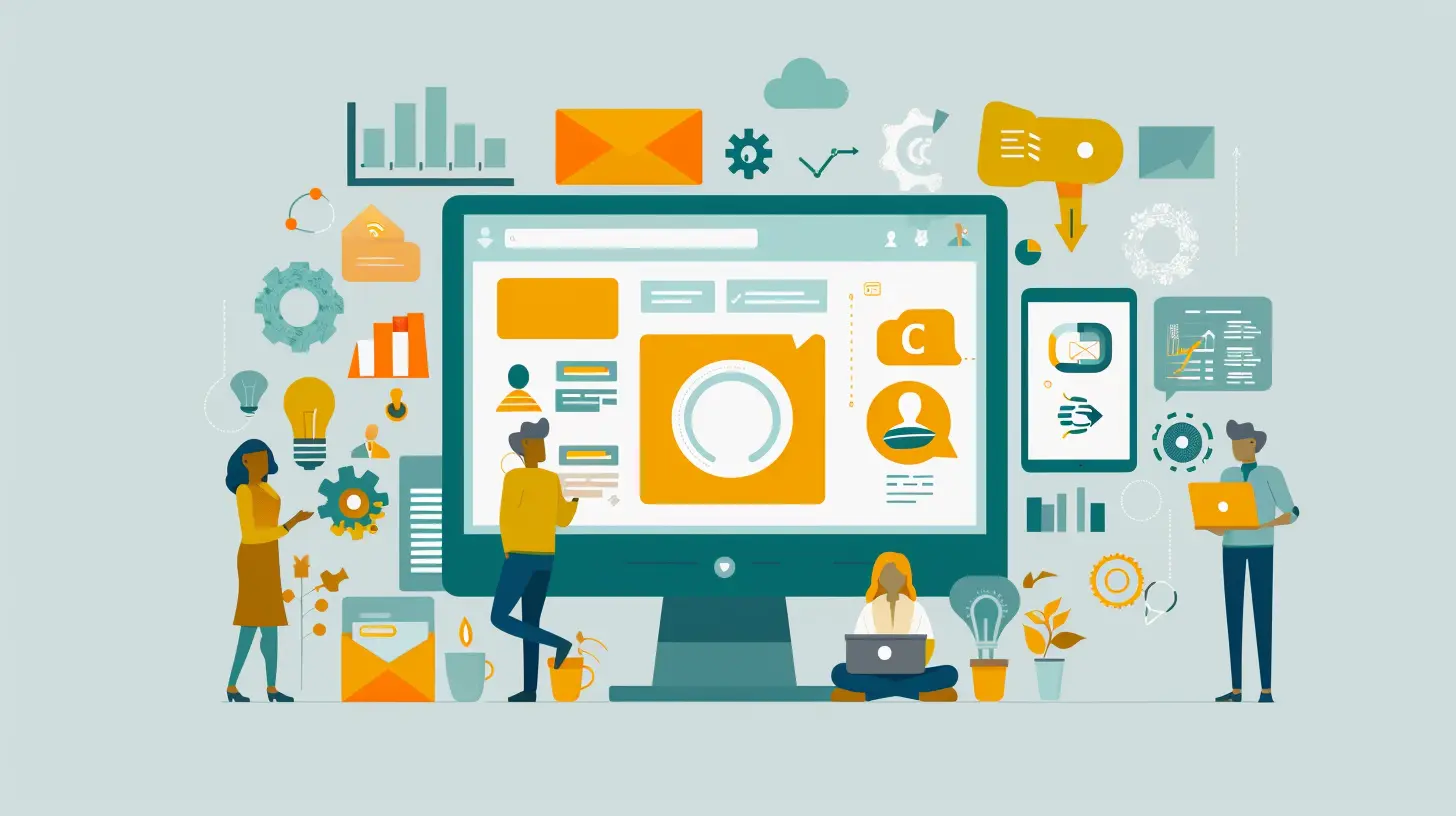
Speed Things Up—Nobody Likes to Wait
Website speed isn’t just about SEO (although Google definitely cares); it’s about keeping users engaged. If your B2C site takes more than 3 seconds to load, you could lose half your visitors before the party even starts.Optimize Images and Scripts
Compress your images without sacrificing quality. Lazy-load what you can. Minimize JavaScript and CSS where possible.> Think of your website like a car. You want it to look sleek, but if it takes forever to start, no one's sticking around.
Mobile Responsiveness Is Non-Negotiable
We’re not just in a mobile-first world—we're in a mobile-everything world. Over 60% of B2C traffic comes from mobile devices. If your site doesn’t look and work great on a phone, you’re leaving money on the table.What You Can Do
- Use responsive design frameworks (like Bootstrap)- Test on multiple screen sizes
- Keep clickable elements large enough for thumbs (fat-finger-proofing is real)
Design with Emotion and Brand Personality
People buy with emotions and justify with logic. Your B2C website isn’t just selling products—it’s selling a lifestyle, a vibe, a feeling.Choose a Color Palette That Matches Your Brand
Colors set the tone. Soft pastels give off calm and cozy. Bold colors scream energy and excitement. Pick colors that align with who you are and how you want your visitors to feel.Typography Matters
Don’t use a font because it looks “cool.” Use it because it’s readable and reflects your brand. Clear, legible fonts keep users comfortable and engaged.Craft Killer CTAs (Call-To-Actions)
Your call to action is like your wingman—it should nudge visitors to take the next step. Whether it’s “Add to Cart,” “Sign Up,” or “Get 10% Off,” make sure your CTA buttons pop and make sense.CTA Best Practices:
- Use action words: “Buy,” “Get,” “Start”- Make 'em big and bold
- Keep colors contrasting
- Place them in multiple spots, not just at the bottom
> Think of CTAs like green traffic lights. They tell users, “Hey, go here next!”
Create Trust Through Design
Would you give your credit card to a sketchy-looking site? Nope—and neither would your customers.Add Trust Signals
- SSL certificate (yes, that HTTPS matters)- Reviews and testimonials
- Secure payment icons
- Real photos of your team or business
- Transparent return and privacy policies
These elements reassure your customers that they’re in good hands.
Use High-Quality Visuals
This is where you can raise the bar. In B2C, first impressions are often visual. Poor-quality images can make even the best products look bad.Showcase Your Products Right
- Use multiple angles- Include zoom features
- Show the product in real life (lifestyle shots)
- Add videos if possible
The more your customer can "experience" the product online, the more confident they’ll feel buying it.
Simplify the Checkout Process
The checkout process is where many B2C sites lose the sale. Don’t let a clunky process turn a “yes” into a “meh, maybe later.”Make It Easy:
- Allow guest checkout- Minimize form fields
- Auto-fill address fields
- Show progress indicators (“Step 1 of 3”)
- Provide multiple payment options (credit cards, PayPal, Apple Pay, etc.)
Think of your checkout process like a funnel—remove every unnecessary step until water (sales) flows smoothly.
Personalize the User Experience
People love feeling special. Why show everyone the same homepage when you can tailor it based on their behavior or past purchases?Ideas for Personalization:
- “Welcome back, Jamie!”- Display recently viewed items
- Recommend products based on browsing habits
- Offer discounts for return customers
This level of customization creates a bond—and increases the chances of repeat business.
Make Content Work for You
Content isn’t just a blog thing—it’s all over your site. Your product descriptions, about page, and even form labels play a role in user experience.Do This:
- Write like a human (not a robot)- Highlight benefits, not just features
- Use storytelling to add emotional weight
- Include FAQs for clarity
Test, Test, Then Test Some More
You’re not done after hitting "publish." Optimizing user experience is an ongoing mission.What Should You Test?
- Button colors- CTA wording
- Layouts
- Headlines
- Mobile responsiveness
Use A/B testing tools like Google Optimize or VWO to see what works best. Sometimes, even changing a button from blue to red can increase clicks.
Make Use of Analytics & Heatmaps
Understanding how users interact with your site is like having a behind-the-scenes look at customer behavior.Use Tools Like:
- Google Analytics (for traffic and flow)- Hotjar or Crazy Egg (for click maps and scroll maps)
This data helps you see what’s working and what’s just taking up space.
Keep It Fresh and Up-to-Date
A neglected website screams “We don’t care.” Update your visuals, rotate featured products, refresh your content—show users that you’re active and engaged.Final Thoughts
Designing your B2C website for optimal user experience isn’t just about being trendy—it’s about being smart. It’s about making life easy for your users and guiding them effortlessly toward making a purchase.When you combine intuitive design with speed, clarity, and emotion, your site becomes more than just a digital storefront—it becomes a business powerhouse.
So take a good look at your current website. Where can you simplify? What can you improve? Because when your users win, your business wins too.
all images in this post were generated using AI tools
Category:
B2c MarketingAuthor:

Susanna Erickson
Discussion
rate this article
2 comments
Jack Clayton
Designing for user experience is great, but let’s not kid ourselves—if your site looks like a 90s throwback, your customers will bounce faster than a bad first date. Time to update that look and stop scaring away potential buyers, darling!
April 10, 2026 at 2:28 AM
Susanna Erickson
Absolutely! A modern design is crucial for retaining users and enhancing their experience. Let's keep our sites fresh and inviting!
Lola McDowney
Creating a B2C website with optimal user experience involves intuitive navigation, mobile responsiveness, fast load times, and engaging visuals. Prioritize user feedback to continuously enhance functionality and satisfaction.
April 3, 2026 at 2:40 AM